Following this book as a guide for completing this we first ask ourselves three questions when we are looking at the final result:
1. Does it make sense?
2. Does it look cool?
3. Does it work in the game?
And if all of these work, you have yourself a winner! Some brilliant advice that I will definitely be looking at.
Project: Creating a Brick Wall
Creating a Brick
To begin with we started off by creating a basic cube which we placed into the middle of the scene which was a certain height.
We then beveled the edges of all sides of the wall to make the edges round like some brick walls are and then duplicated the brick twice so that we had three in total to work with.
Adding Nook and Crannies
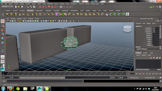
We then went about making the wall look older and as if it had been there for many years. We went about this by first creating a sphere and deleting the bottom half so that it becomes a half-sphere which will be used as negative space to carve out elements of the bricks already made.
We then made the sphere a weird shape by extruding the top part, not including the bottom piece, and change the randomisation of it so that it looked more rock like and then added a triangulate feature onto it so that it looked smoother and less jaggedy.
I then duplicated the rocks so that there were a few of them and extruded them in different ways so that they looked a bit different, then applied them to the sides of two of the bricks so that they could be cut away after; leaving a nice indent when taken away.
Layering Bricks
We now wanted to create the actual brick wall but in a way in which it looked like it was done by traditional masonry methods, not creating in a linear pattern by a machine. First we started by organising the scene a little better by starting to group the objects and get them into the correct place so that we had two groups of 'dirty' bricks and then one group of 'clean' bricks.
We then wanted to start actually creating the brick wall and to do this we started by creating a cube in the background for the basic shape and then laying out the clean bricks on top of it in a generic pattern that is using the traditional masonry method. I completed this all the way up the cube so that in the end I had a complete wall of clean bricks.
We then wanted to incorporate the dirty bricks into it so that it looked like it had more wear and tear but then also so that the bricks where not all the same as they would have looked too linear, so by mixing in the different types of bricks it adds more realistic qualities to it.
After this we then added more randomisation to it by selecting the dirty brick group in the ouliner and selecting every other brick to change the 'y' rotation on it, and then we picked a random load of bricks and changed the 'x' rotation and then another load of random bricks and changed both the 'x' and 'y' rotation; again just to ensure that no two bricks looked the same.
You Can Never Get Enough Chance
For the last part to creating the wall we wanted to add even more randomisation onto it so that no two bricks where in the same place, we achieved this by selecting random amounts of bricks each time and then changing aspects such as how far in or out they were compared to the cube at the back, and then moving them down and left slightly and then also rotating a few of them slightly to the left and right. These little movements and adjustments to the wall make it seem all the more realistic and make the wall appear more alive.


No comments:
Post a Comment