The Art Direction of "Frozen" by Michael Giaimo (Disney Animation)
This talk was probably one of the most anticipated of the whole week, pretty much due to everyone's obsession with the film Frozen and it definitely didn't disappoint. The talk was taken by Michael Giaimo and he started by talking about the initial inspiration for the film, which was obviously Norway but it is also based off the original Frozen story. The traditional story was actually a lot smaller, there was no palace, no castle, no sister relationship, but I believe that they have changed this for the better. Most fairy tales just have a few locations in it but they wanted to expand the narrative further and make the world feel bigger.
They knew it would be set in Norway before it all begin, like in the original Snow Queen story, and they wanted to keep that true to the real version. As the story expanded Norway seemed to be the perfect location as they had beautiful visuals. So this brought on their trip to Norway so that they could get more inspiration and get a first-hand look at the organic Fjords in the environment, which is an element that they were really excited to bring into the story. The rock faces were so vertical that Michael really liked the look of them against the placid water as it stood out so much. They also wanted to bring in an architectural environment into it so started to look at the churches in there as they were all designed in the middles ages and were completely made out of wood. They had a broad shape and were mixed with intricate details on the roofs.

They took both these architectural and organic environment details and put them both together to create the Frozen Kingdom. The castle itself takes a backseat to the environment and its quietly there amoungst the the still water and the vertical fjords. They took a lot of influences from the Norwegian palaces to be able to create the interiors.
The Power of White and Light
Snow is like a blank canvas and you can put any colour over the top of it to bring it to life and this is what they wanted to do just to create that strong contrast with the environment, giving it a small pop of colour. They created a kind of ribbon effect for creating the snow on the ground. They wanted the colours to be high in saturation so that instead of just being white you get all of these other colours coming through at the same time.

What they wanted to do with the fjords is stretch them up as high as possible so that it gave the imagination that they were so high, but this had to still be realistic with the rest of the environment and stick within realistic limitations.
Ice Hotel
They also visited the Ice Hotel while they were in Norway and took a lot of inspiration from there as well, especially at night which created such beautiful lighting and colour patterns across the whole hotel which is something that they really wanted to bring into the environment of Frozen.
Character and Costume
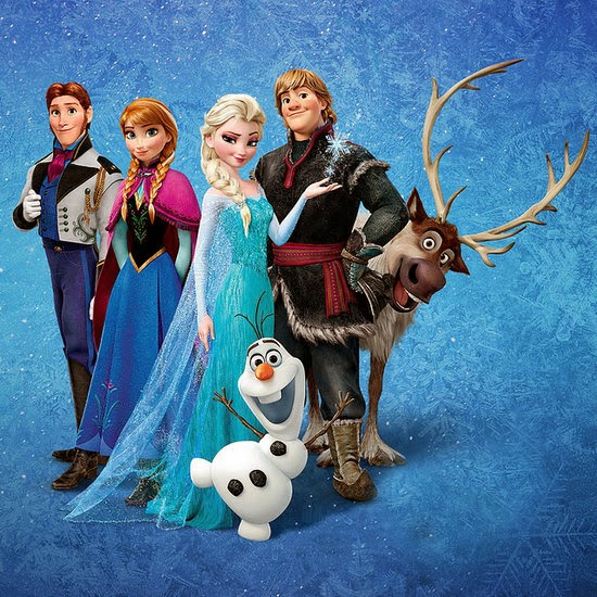
They wanted the time period of the film to be based around 1840, which is a time where most fairy tales are set. They worked with a costume designer to create the authentic Nordic clothing for Anna. The clothing themselves have a rich saturation, especially Anna's as we need to see her as the main character and ensure that she stands out from any other characters. These colours in the clothing also work well against the snowy background and just emphasise the colours further, For the men in the film, they also took inspiration from Nordic clothing, but for Christoph his was slightly different. His was taken from Sali tribes in Norway who were fishermen, farmers and reindeer herders, which depicts his character even better. Elsa's queen dress was probably the most difficult to design as it was extremely long and when it is spread out across the floor it actually forms the shape of a snowflake which was designed even before the ice palace was, so its easy to see where the design for that was influenced from.

The director told them 'to use nature and take what you have found in the real world and put it into your own created world', which I think it a fabulous quote and something that I may refer to in the future if I ever start to look at real world environments.
As they knew that it was going to be shot in widescreen they wanted to really exploit the framing so that they can see how the colour saturation comes through and keeps that original vertical and horizontal feel that they got from their trip to Norway. Finally they wanted to bring in and use a strong use of values so they ensured that dark was dark and light was light. They really wanted to bring in this so that once again it really influenced the saturated colours of the snow and emphasis the different colours in the environment.

Overall this was a brilliant talk and I learned so much about how to bring a real world environment into something like an animation, which was really interesting to see how it could be executed. This is definitely something that I feel that I could bring into my own world into game environments and experiment looking at how real world came be influenced to create something based around it.
No comments:
Post a Comment