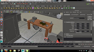
Once I had finished all my modelling I went onto texturing the lab. This was a very lengthy process that involved taking all the geometry in the room that needed a texture, which was pretty much all of it, and creating a unique piece of texture for it. What I wanted to create was quite a dark looking lab that was very dirty with spills all over the floor and mould on the walls and ceilings. I really wanted to use the idea that it was some kind of cellar or basement that didn't have any natural light and was rather grungy.
I started texturing the relatively easy stuff first, like the floor and shelves, as these were flat surfaces, and after do the difficult stuff as this would require more time and effort. The texturing as a whole went very smoothly and I only encountered a few problems, like when texturing the time machine itself and then also the cylindrical vat in the background, just because they contained difficult shapes on them, but I overcame this with a little grinding on the internet. Altogether the lab was fairly easy to complete as for many of the assets they were simple to apply to texture too, like the books for example, which where rather cheated as just the book front where textures and the rest of the model has a plain textures added. This was a good cheat to use as many of the shapes and texture will not be seen in that much detail.
I had previously added a floor that contained little mess on it, and then also the tiles where to big on the floor so I went back and redesigned this with more colourful mess on the floor and then also papers lying about so that it looked like more of a messy work environment.
I realised that at this part I didn't like the look of the shelves so I changed the colour to match the desk and parts of the cabinets. I really liked how it was shaping up and liked where it was going in terms of the colours and how dirty it looked.
I then started to add the elements onto the shelf which took me the longest to complete as there were so many things on the shelf. I started by looking at the books first which I had put all around the room. These took a long time to create but I was able to cheat and just add the book end
I then really didn't like how the walls were looking, I wanted them to have mould going up the walls and ensure that it looked more like a basement with a grungy look to it which I think worked really well in the end as you can see it going up the walls, which will eventually join onto the ceiling.
Overall I am very happy with how the lab tuned out. I think it gives off the right effect and fits not only my character but his personality as well. After I finished the texturing I add the lighting in the room to give the effect that it was a dark environment with only one single light from above. I then went back to the modelling stage to add the ceiling and details in before texture this as well and making sure it was all finished.
Below is what the room looks like at the moment in render preview. I really like the look of it, even though the ceiling and light were immensely rushed.
Once the lab was finally finish, I went onto looking at how I could add a dim light that would be filtered from the light on the ceiling. When I was filming I made sure that it looked dark already so a little light from above should not change how my character looks.


No comments:
Post a Comment